
Reduce uncertainty
I wanted users to immediately see what they could press, where they were in the flow, and how to back out if they changed their mind.
A coffee-machine redesign focused on clearer choices and less second-guessing
I used this project to rethink how a coffee-machine interface could feel calmer and easier to trust. My starting point was simple: small screens like this often make people pause, guess, and double-check themselves. I wanted to keep the machine capable, but make the flow much more obvious.
Coffee machines have to say a lot in very little space. If the interface is too minimal, people have to guess what comes next. If it shows too much, they slow down and start hesitating. The challenge here was finding a middle ground where the machine still felt simple, but not vague.
I wanted users to immediately see what they could press, where they were in the flow, and how to back out if they changed their mind.
The interface needed to explain itself quickly instead of assuming the user already knew the machine.
I wanted it to feel modern and focused, but still quiet enough that the interface itself did the talking.
Early on, I explored a few different interaction styles to understand how direct the machine should be. Some concepts leaned more explicit, while others were cleaner and more minimal. What I was really testing was how much guidance the interface needed before it started feeling heavy.


The final direction came from the versions that felt easiest to understand at a glance. I kept coming back to the same idea: if someone walks up to the machine for the first time, they should not have to decode it.
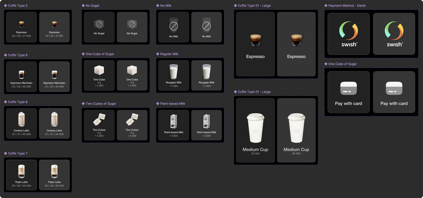

The result is a visual and interaction direction, not a validated outcome. I did not test it with participants, so the next step would be to watch first-time users choose a drink, correct a mistake, and understand the brewing state without help.
Open Full Case Study PDFI'm looking for UI/UX and interaction design work where I can keep making interfaces feel clearer, calmer, and easier to use.

Press Escape to close or click outside the image.